Designing your sign (Artwork)
 A simple yet effective and memorable sign
is a great asset. Whether you already have a logo and some basic
design criteria, or you are starting with a clean sheet of paper,
there are some basic "rules" to observe.
The first and best
rule is to keep a project relatively simple. Squeezing as much copy
as possible into a small sign is general detrimental to the overall
goal. Pare down your message to its basic essentials; inform your
customers or viewing public of the things about your business that
you want them to remember and recall.
Once you have determined
your message, the size of the sign has to be determined. Local codes,
placement requirements, and cost could be any of a number of factors
influencing this decision. After determining the optimum size or
sizes for your application(s), you can start building a basic design
or layout.
One of the most important
and often overlooked design factors is realizing and using the actual
real world copy space. The amount of
usable area, or copy space, on a sign is usually somewhat less than
its overall dimensions. Following is
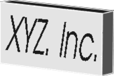
a graphic example using "XYZ Inc."
Immediately below
is a representation of a 30"x 120" sign. The layout is simple, with
only the stool and the upper text outlining as extra touches. As
you will also note the actual copy area is well inside the overall
sign. The outermost black line (wide) represents the sign cabinet.

This
next representation is a trace, or pattern of what is really needed
to make your sign. Notice the black box surrounding the copy. This
box is the actual usable copy space on a plastic sign face.

To
calculate the actual copy space, deduct 8" from the overall height,
and 8" from the overall length.
Having a 30"x120" sign
makes our actual usable copy space 22"x112" (which is represented
by these images). For manufacturing purposes the "trace" drawing
along with color information is all that is needed to create your
sign. You should also note that these examples are formatted for
Web presentation, i.e. they are GIF images. To create a sign from
your files, the art has to be saved in a vector format. Such formats
are .plt, .cdr, as well as certain .ai and .eps files to name a
few. Windows Metafiles (.wmf) are also acceptable. We have to be
able to actually plot the lines in the file, actually making a full
size drawing (pen plot), versus printing (groups of dots).
Copy Space-
The amount of space (height x length) in which copy can be placed
for viewing. Copy is defined as text, logos, borders, or any other
object to be viewable on the front a sign.
Dimensions-
The terminology in denoting the size of a sign, copy space, or any
general area is normally expressed with the height, or vertical
dimension, first, then followed by the length, or horizontal dimension
second. 48"x96" denotes a sign or area 48" high, and 96" long. Relative
size of the dimensions do not change this orientation. 96"x48" would
denote a sign or area 96"high, and 48" long. A third dimension is
added usually to represent a depth, or width of a sign cabinet.
 48"x96"x10" denotes a 48"x 96" sign that is 10" deep.

